The other day I was grocery shopping at Meijer. While waiting in line to check out I found my eye wondering across their ceiling and reading the department locators they have placed around the store. In my usual geek way, my mind wondered to my professional life and I started thinking about website navigation.
Navigating Through the Grocery Store is the Same as Navigating Through a Website
 I’ve been shopping at this particular Meijer every week for about seven years. I know where the groceries and products are located and I could probably walk blindfolded to many things I commonly buy. But what if I normally shop at Kroger and this was my first trip to Meijer? How overwhelmed would I be? Meijer is huge and the store sells everything from milk and paper products to bathing suits and auto supplies. If this were my first trip I would be utterly overwhelmed by the variety of products and the size of the store. Meijer has obviously considered this because their ceiling provides an easy to use map of the store layout and it quickly navigates you to core locations (or departments) within the store. Need baby products or kitchen supplies? There is a sign for both and they even offer an image for those of us frantically looking for diapers in a late night store run. Think about how convenient and customer friendly this is for visitors.
But what about their website? Is it just as friendly? Yes, yes it is.
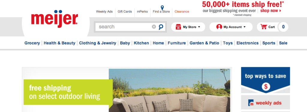
Their primary navigation provides easy to find links to the exact same departments. Their home page offers images of top items as well. I think they’ve done a great job making sure users are welcomed to their website in the same manner they would be at the store. Their website provides an easy to use navigation system that mimics that of the physical store.
Make Website Navigation Easy
A website, and in particular a home page, must quickly communicate what you offer and what users can do on your website. Website visitors need to be able to quickly determine what your website is all about. Your navigation is a key part of answering that question. People want to be able to answer the who, what, and why of their visit quickly. Having a navigation menu that clearly points visitors to an About, Products, Services, and Contact is important. Using common language is also important. We frequently get asked to use industry jargon or quirky terminology in navigation, but we discourage it because it confuses visitors. Don’t make your visitors try and decipher your terminology. Make it easy on them or you’ll lose them.
The goal of any website should be a pleasant experience that provides solid information and answers a visitor’s questions. It should encourage visitors to do something: fill out a contact form, buy a product, request a service, or download a report. Anything that connects the visitor with the website and makes the visit tangible.
How Effective is Your Navigation?
So what about your website? Most likely you have a really good idea where your content is and how you can interact with it. But is this apparent to your website visitors? Does you home page and navigation quickly give website visitors an idea of the who, what, and why of you? Does it provide an easy to use map to your most important content? If you’re not sure, take a step back and look at it as if you are an outsider. Does it work? If it doesn’t, what can you do to correct this issue?
If you’re still not sure if you have navigation issues, head over to Google Analytics and look at your bounce rate. I was very careful in creating our navigation and our home page, as I wanted people to easily find the information they needed. It worked. When we redesigned our website our overall bounce rate dropped to less than 10% and our home page has a 1.2% bounce rate. Why? Because I thought about who we help, what they need, and I made sure everything is easy for them to find. I know we can continue to make improvements on our website, but navigation and locating information is solid because visitors tell me so. It is what differentiates our website from others – or that is what I’ve been told by some of our new clients.
Need Help Mapping Out Your Website?
If your website navigation or home page is lacking direction we can help. It’s what we do and it’s what we love. We’ll help discover the who, what, and why of you – then we’ll design a website that coverts all that goodness into easily digestible information.
Stop by our contact page and let us know how we can help with your website >>
Web Savvy Marketing
TwitterYoutubeFacebookLinkedinGoogle +