When I founded our company three years ago I was highly focused on SEO. I quickly learned that for most companies, effective SEO meant rebuilding their websites from the ground up. While this wasn’t my initial plan, it was where we ended up. What I didn’t realize is that I was going to love website design. Without question, I fell head over heels in love with WordPress and the world of website design.
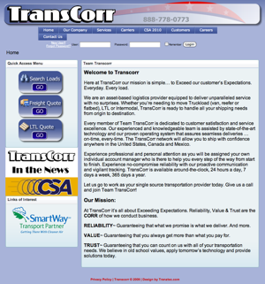
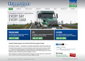
I love to watch Google Analytics shift from good old fashion SEO, but I also love to hear my clients provide feedback on what a more professional design has done for their business. Hearing a business owner tell you their revenue doubled and their leads are much more qualified is music to my ears. Our clients’ success stories does my soul good and it makes me happy. Web design makes me happy.
Last week I received a voicemail from a gentleman I spoke with over a year ago. Once I saw his website, I immediately remembered him because he was in my local area and I was very familiar with the industry in which he works. His voicemail stated he wasn’t getting any return from his website. He said he wasn’t getting organic traffic and the pay per click traffic he was buying wasn’t generating any leads or revenue. When I pulled up his website I had a flashback to our prior conversation. The man felt he could do everything on his own and that he didn’t need to pay for professional help. He added his logo to WordPress’ basic Twenty Ten and then added a few scant pages of content. He thought that would be enough to bring in oodles of traffic and convert that traffic to new clients. The problem is his website looks unprofessional and it lacks any real content. I wasn’t at all surprised that his PPC campaign wasn’t producing.


As much as I hate to admit it, I didn’t return his call. From his voicemail, I could tell he was in the same position and mindset is the same as it was a year ago. I can’t change his mind then, so I know I cannot help him now. This immediately upset me and brought my mood significantly down – but only for a moment. What I did was remind myself of all the people we have helped over this last year. My mind whipped through all the web design projects that did make a difference. My mood immediately shifted and I was once again in love with internet marketing, website design, and the Genesis framework.
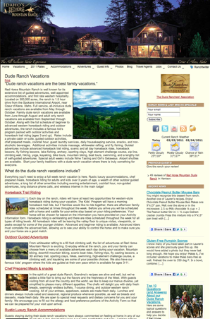
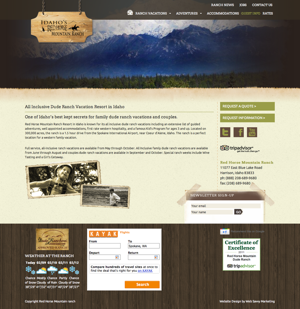
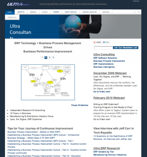
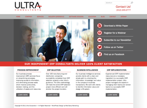
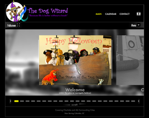
I thought I would share a few before and after images of website design clients we’ve had over the last year. This is far from all of them, but these are some great examples of strong website design and how it can shift the impression a website leaves on visitors. Make no mistake, a professionally designed website does make a difference. And if people can’t afford a completely custom website, then a professionally designed stock theme can be just as powerful if implemented properly.

I’ve always believed a strong website presence is the foundation of all marketing activities. Everything you do online typically returns to the website. You need to have a place you’re proud of, where you can invite people in, and leave a really good first impression.
I’m happy that I can help people craft that first impression and that some how along the way, I found my way to the world of headers, footers, colors, and code. It’s truly been an amazing journey these last few years.
Well done, Rebecca. Congrats on all the great work, and the stellar results experienced by your clients. You and your team know your stuff! Yes, the website is the hub of all marketing activities. It has to become the highest performing program there is!
From the content side, it’s a source of great frustration to me that my clients often forget that web visitors are impatient and on their own “missions” – searching, snacking for info from a variety of sources…. they don’t want to wade through cutsie copy or scads of content.
This is backed up time and again by the undisputable research findings of Nielsen Norman Group, sponsor of many training programs I”ve attended:
http://www.useit.com/alertbox/percent-text-read.html
Report findings: “On the average Web page, users have time to read at most 28% of the words during an average visit; 20% is more likely.”
Writing Style for Web vs. Print
http://www.useit.com/alertbox/print-vs-online-content.html
Report findings: “Web content must be brief and get to the point quickly, because users are likely to be on a specific mission. In many cases, they’ve pulled up the page through search. Web users want actionable content; they don’t want to fritter away their time on (otherwise enjoyable) stories that are tangential to their current goals…”
Didn’t mean to go on a rant here! Your post reminds me that what is key is to design a site (and populate it with optimized content) that produces a marketing ROI… It is key to actively monitor web metrics like time on site, number of pages view, bounce rate, etc… because the results speak for themselves!
Julie your “rants” are always welcome. You provide a significant amount of value, especially on the usability front. Thanks for reading and adding some great add on info for other readers.