Each and every day we take journeys. We embark on customer journeys in both the physical and digital worlds.
Years ago our journeys were limited to store fronts and physical goods. Today we live in a multimedia world of websites, social media, chat sessions, newsletters, email, and call centers. These digital journeys have changed the way we interact with companies and products.
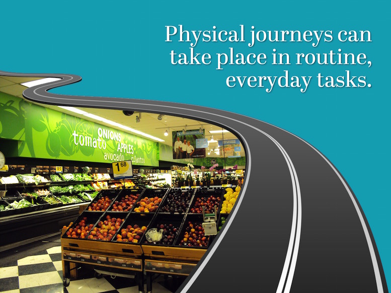
Last week I decided I was going to try shopping at a new grocery store. I was on my way home from the ortho with my son and I was passing by a Kroger that was recently given a facelift. I thought I would try it out and forgo the extra few miles I’d need to drive to get to my regular store.
Guess what happened? I was a big fat ball of stress the entire time I was in the store. I could not find everything on my list, regardless of all the signs throughout the store.
So what went wrong with my journey? Here are a few mental notes I made as I silently vented in frustration:
- There was bread here, there, and then there was bread way over there.
- The dairy section was along the entire back wall and it seem to last forever. I had no idea when I’d actually get to the sour cream or if I’d even find it.
- Personal care products were in multiple areas and no matter hard hard I looked, I never found my fluoride rinse. It’s a week later and I still don’t have any.
I was aggravated and I left the store with much less than was on my shopping list. As I walked out the door, I pledged not to return. Instead I would head back to Meijer where I could locate the items I need and where the pharmacy staff know me by name.
That example was an illustration of a customer journey in the physical world. A very negative journey that will leave a lasting impression.
The same journey could have easily taken place in the digital world. And I actually mimicked the experience on both stores’ websites. I attempted to locate the dental rinse that I was looking for at Kroger.
Guess what happened? The Kroger website left me at a dead end and I had to reroute myself a login screen to see if the store even carried my brand. Fail! The Meijer website took me straight to where I wanted to go. Quickly and without pain and suffering.
In today’s world, a digital customer journey doesn’t just start and stop at the website. Instead it spans across multiple types of communication methods from email and chat boxes to social media and apps. We have oodles of opportunities to interact with each other and make a lasting impression.
In the physical world a store owner or seller can interact one on one with the buyer. They can visually see a person’s reaction to a product, display, or event. They are present, in the here and now, and they can receive customer feedback.
This provides invaluable data and allows the seller to optimize and fine tune their processes.
When the world moved to digital, we were presented with a massive amount of new challenges.
The digital world is completely different the that of the storefront. We cannot “see” anything. Instead we have to use alternate methods to gain feedback. This makes the process of selling much more difficult and much more involved.
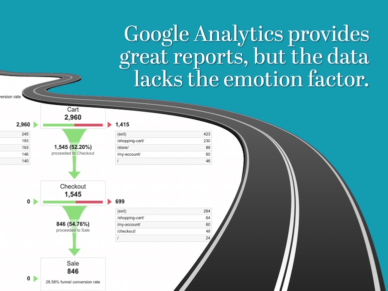
Google Analytics provides some feedback for us and while some of the reports are amazing, they are data based and they lack the emotional factor. They are a good starting point, but they are very limited.
This forces us to look for emotion and feedback in other sources. And while you might feel these do not exist, there really are alternate sources of data.
The customer journey can span across multiple types of communication channels. With a little effort, we can obtain feedback from a number of different locations:
- Search engine results click through rates
- Website analytics like top pages, bounce rates, and exitsWebsite inquiries
- Website offer response rates
- Emails
- Social media shares, likes, and comments
- Customer reviews
- User interviews
- Surveys and polls
- A/B testing results
The trick is to monitor this feedback, analyze it, and take action to improve the customer journey.

Have you ever been to an IKEA store? We have one in Michigan and while it may be a drive, it is worth the time to visit. I love IKEA because it is an example of a highly optimized customer journey.
These fine folks have mastered the art of the physical shopping journey. There is no question on where you’re headed, where your desired products resides, or where you can find some yummy Swedish meatballs and cinnamon buns.
IKEA even a offers a random doors to provide a quick escape should you need it.
They have the journey so well mapped, that they have their customers pick their own goods out of the warehouse. And guess what? You can always find what you need. And in the rare event that you can’t locate your item in the warehouse, there is a computer or sales associate close by to provide assistance.
Once you get home with your new furniture, they provide helpful illustrations and instructions to guide you through the build out. Should you get lost, there is a handy help line available.
I’ve built a lot of furniture from IKEA and I’ve not once called the help line. I didn’t need to call, because I found their instructions to be just as easy to follow as the arrows in their store showroom.
What if you could translate that physical experience into the digital world?

Website design isn’t just about headers, footers or sidebars. Good design is about asking the right questions and making sure those questions apply to your website visitors.
It’s about finding solutions to your visitors’ problems and presenting these solutions within a cohesive design. It’s about mapping a journey for your visitors and creating clear paths for them to follow.
Successful website design isn’t about me or you. When done right it will be focused on your visitor and how your website can help them locate the right information and encourage them to take action.
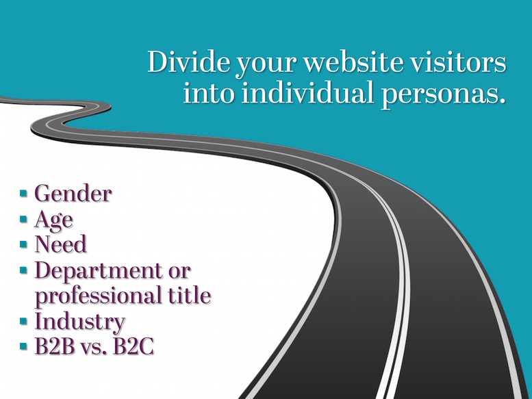
I tend to compartmentalize things and people. I mentally place people in boxes and segment them out into groups like my family, neighbors, friends, WordPress community and so on. I’ve often referred to these groups as my “boxes” and I do not like them to intermingle or randomly change. These boxes structure my communication and they dictate how I interact with one individual versus another.
Why would a web designer or company want to segregate their web traffic into boxes?
So the marketing message can be tailored to each persona or boxes of visitors. Once you have your personas defined, you can create unique messaging targeted to those personas, you can better articulate your offering, and thus convert more web traffic.
One of the first steps in defining user personas is to document who you sell to and define characterizes of each.
This list is how I like to start documenting the basic elements of each possible persona.
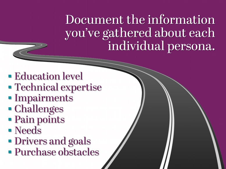
Next I like to dive further and go a bit more personal. Creating a list of customer personas that use the above data points will take time, research, and a bit of investigation. But keep in mind, if you know your customer base, you already have all of this information.
Education level, technical expertise, and impairments all directly relate to the design of the website.
Challenges, pain points, needs, goals, and purchase obstacles all relate to the content within the website.
You have to marry design and content to make a website successfully convert visitors. And this can only truly occur if you match these data elements up to individual personas.
The goal is to present different information to each individual personas and make sure this information is easily accessible.
The more your present your visitor with information designed around their needs and wants, the higher probability you have in converting them into a subscriber, prospect, or sale.

Once you’ve identified your personas and documented information about each, it’s time to review your existing website content to determine what content is available to use in speaking to these personas.
If you’ve never done this before, the chances are pretty high that you won’t have a lot to offer.
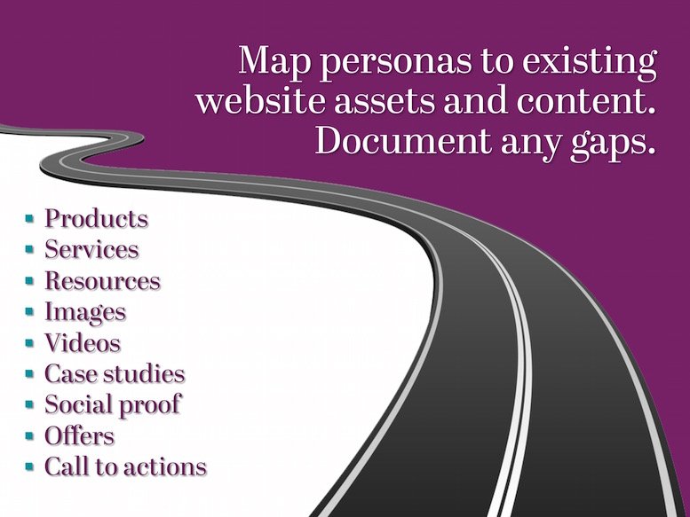
Go into this activity with a positive attitude. Know that gaps will exist and that these gaps are not a failure on your part. Instead they represent opportunities for improvement.
Review each section of your website and each type of available content. Map this content to a given persona. If none exists, that’s okay.
I’m a big advocate of creating one base page per persona and having this page route to other core content on the website.
Here is an example:
In my old world of ERP software, our general personas were broken down into C-level executives, CFOs, IT managers, and department heads. Each persona had different pain points, challenges, and goals. For example:
- The CEO wanted to increase revenue so he cared a lot about reporting with a particular emphasis on sales data.
- The CFO was always focused on cost cutting, month end closings, and compliance issues.
- The IT manager just wanted you to make his life easier, which meant he cared about quality of code, support, and making sure someone had his back should disaster strike.
You had to talk to these different people in different ways, because they cared about different things.
Being able to acknowledge their challenges and provide a path to reaching their goals would speak stronger than any feature or function you presented. You could only truly achieve this by targeting them with persona based content.
I applied this same theory to the onsite software demonstrates I performed. These were usually eight hour events, so I had to focus to get myself through the day.
When I spoke to the CFO I made sure I talked to his persona, which would always provide a connection for us because he knew I understood him. When I spoke to the CEO I shifted gears and I spoke about reporting of sales forecasts, lead funnels, and revenue.
Guess what? It worked. I rarely had an onsite demo that didn’t end in a sale.
Persona based content does the same, but does so in a digital format. It builds trust and authority without the physical presence.
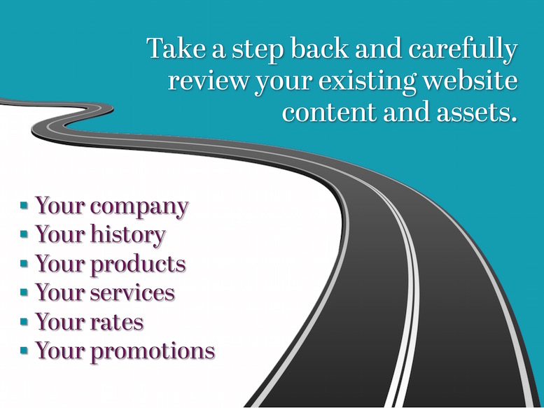
Now I’d like you to take a step back and with a clear and open mind I’d like you to consider your existing website.
Think about your content and design. How much of this talks about the above topics?
Notice how many times the word your is mentioned. I do this because in most cases website writers talk about their company name, product names, and so on and rarely ever talk about their visitor.
That is a big mistake.

Think I’m being over dramatic? Go to your Google Search Console account and look at the Content Keyword report. How much of that list includes your company name or product names? How much of it includes words the visitor is actually searching for?
I can rest my point here, because I’ve experience this so much I would bet money on my assumptions being correct.
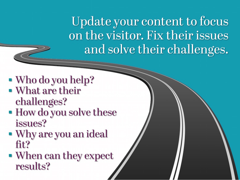
You need to update your content to speak to your website visitors. Acknowledge who they are, what they do, what they struggle with, and how you can help them.
Make sure you speak your visitor’s language and please oh please don’t flood them with your product names and copyright symbols. Instead just talk about their needs and how you solve them.

Have you noticed I really haven’t talked much about graphic design yet? That’s because graphic design or WordPress theme selection should only come after persona definition and site mapping.
You can’t craft a design or select a off-the-shelf website theme until you know what that design and theme need to accomplish.
I frequently receive emails from people asking me what stock theme they should select. I always reply that I cannot answer it. I have no idea who visits their website, how their company helps them, and what they offer so I cannot begin to offer suggestions on design.
We go through discovery with clients well before design, because we believe design is a process and not simply a decision made in a singular moment.

As you consider your website design and how it can be improved, think past the home page and desktop.
Remember that visitors can enter your website from any device and through any page or post. If you are good at organic SEO and social media, they’ll enter in from underlying pages and posts more then they enter through the home page.
Because of this, you need to make sure your website interior pages and posts can help route visitors and in the process, start them on a positive customer journey.
And please of please don’t force persona navigation or routing behind sliders and image rotators. People have slider blindness and most visitors won’t notice them and it very very few will ever sit and watch the slides transition.

Your customer journey isn’t just your website. It’s everywhere on the internet. Rarely does a website visitor come once to a website and convert right away into a purchase. They don’t. They come and go and they arrive at different points within the buying cycle.
In my old world of ERP software we had a nine month sales cycle. My world of wed design has a much shorter cycle, but it is still not instantaneous.
This means you have multiple points of interaction throughout that customer journey.
You need to make sure each and everyone is positive.

Here’s the magical thing about journeys – I would have never expected to be where I am today, but my journey brought me here. We each control our own journey and that is powerful.
WordPress provides a massive amount of flexibility and creativity, which allows us to control the digital journey of millions.
The above slides and content are taken from my WordCamp Ann Arbor 2015 presentation which I will be giving this Saturday. If you are coming to WordCamp, I welcome you to come to my session and stop by for a chat afterwards. I’ll be in the Wolverine room at 11:30am.
If you’d like to download my slides, you can find them on SlideShare.
I have been taken to school. This is magnificent and the graphics are so cool and interesting. Bravo. Well done.
Thanks Brenda!
I hope the attendees of WordCamp Ann Arbor feel the same on Saturday. =)
We did.
Your talk really transformed my approach to reorganizing my site and my email autoresponders. Thank you.
Very helpful, Thank you. I’ll use some advices to improve my website.